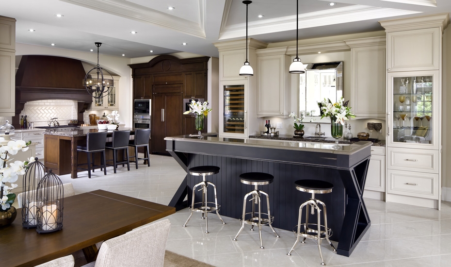

07 Jun Adding Personality to Your Kitchen Remodel
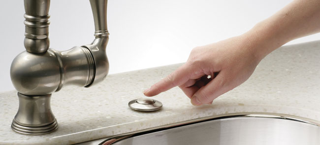
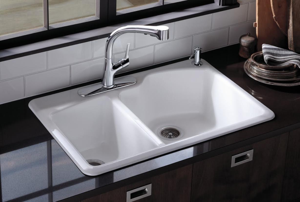
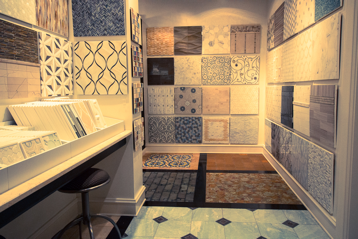
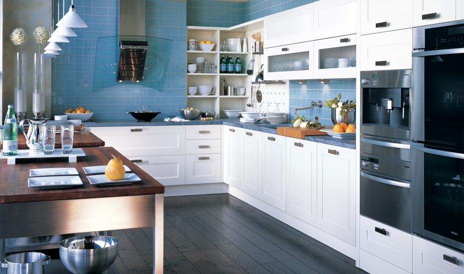
So, you have decided to remodel your kitchen. You’ve done your homework and you have a budget and you have a plan. And you are in the midst of making all the decisions about cabinetry, appliances, flooring, etc. Or maybe you are just looking at...